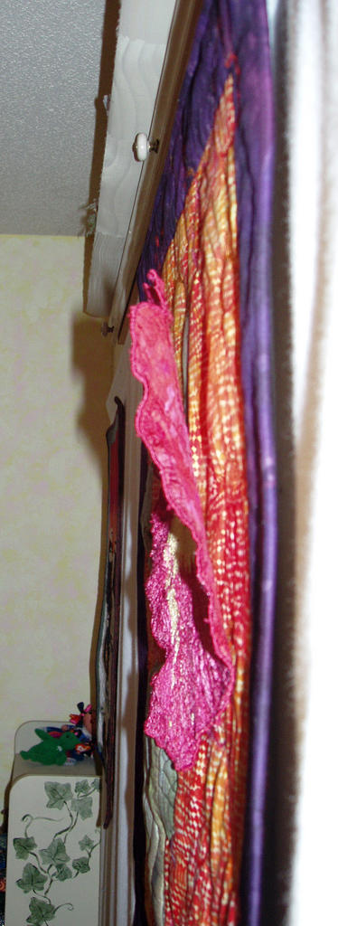

Hollyhocks II
Ring Garden Collection
27 X 25"
Photo-transfer, thread painting, machine couching/quilting
Still in process, this quilt needs something. The quilt is '3-D', where the blossom will be stitched down in the center, allowing the pink to fall forward. It's just pinned right now.
The stem and leaves were quilted to batting, and then added to the quilt top.
The yarn was couched with the machine quilting. It just needs something...I started this quilt a year ago, and picked it back up last week.
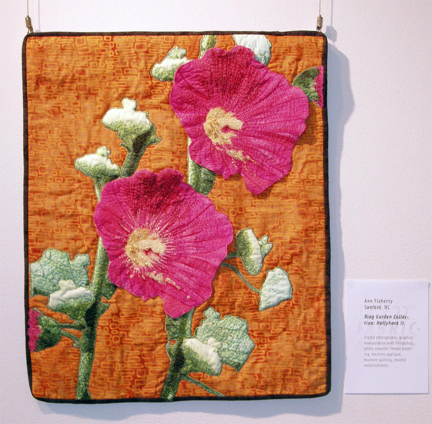
Below is the first piece I made based on photos from the Ring Garden, 'Hollyhocks I'. You can see the 3-D effect better on this one.
This quilt was in the PAQA-South Fabrications show, and then gifted to my dear friend and A-1 nurse, Jan Ring. When I was so ill last winter, she flew down from Boston to care for me, and turned me around when other caregivers seemed to be at a loss. I thank God for a husband who had the sense to call the right person, and dear friends like Jan Ring.
9 comments:
I rather like the strong frame. What is lacking is the dimensionality that the second one has, which comes from the shadow effects. I would also add some more color contrast. If you compare both, the earlier (bottom) one has greater contrasts in color, lots of bright spots with those white blooms and the stronger greens. I would not do too much color change, since the two need to be different, but just a touch of color contrast might help.
Ann - I juat love hollyhocks, an often-forgtten not very fashionable flower somewhow, in my parts of the world anyway. I think you have treated the flowers and their buds really well in each case. To me the heavy border that is troubling you is way too dark for the content, someone else sugested deep purple, the deepest pink in the hollyhock would be nice, also a deeper green of the kind of green you have in the leaves. If you consider making it a lot wider in one of these lighter colours it might make it look a bit more contemporary-decor, arty smarty kind of thing. Also, in the name of repetition, consider instead of straight lines between the orange and the border, repeat the delicate petal-edge lines themselves: you could cut away the black border, make a 'delicate' edge on the orange section, and place it to be mounted against whichever colour you decide, (Tie or sew it on) and leave the edge free as you did with the first hollyhock picture. Again, for repetion, do some of the same couched lines on the border so that those on the orange seem to continue out across the border - you could do this without actually catching down the orange 'delicate' edge - the eye will carry it over the line if your placement is good....
The hollyhock with its couching work is really lovely to me and I like that it is is different--yet similar--style-wise from the other one.
I just had this same type of issue in a recent piece. It might be that your border is unrelated to the main piece. Maybe it can be more incorporated into the overall feel of the piece?
Both quilts are lovely! Since they were photographed at different times + situations, I'd like to know which one has the truest representation of colors prior to suggesting any dramatic changes.
I'm not in favor of comparing these two quilts - they are certainly related, but they are not twins. One has a pencil thin border while the other has a very strong architectural border softened by the gracefully couched threads. If you happen to WANT them to 'match' more closely, the only change needed would be to make the strong border pencil thin...
I like it just as it is - except I'd love to see your signature in a strong shade of deep rose somewhere towards the bottom.
Do what feels right to you and it will be perfect!
Pat in NJ
I really love this piece. What I would like to see is maybe some additional embellishment - maybe some beaded "shadow" flowers or stems/leaves on the background orange. The dark border holds all that color together - but maybe just touch more couching extending out into it? Overall, it is an outstanding piece.
Thank you all for your comments. I got a few to my email as well.
Karen, talked about scale, and I thin she has hit on something. The scale of the stem does not match the flower...it's too big, or the flower is too small. I might make another flower, and extend the stem.
Also, many mentioned the shading of the stem...It needs some dark green shadowing for contrast. Funny how both were printed at the same time, but came out different colors.
I think I'll leave the border. Every computer is reading the color differently...some see it as purple, some as black...it is really a mottled eggplant/purple fossil fern.
I meet with my critique group this morning, and will bring it along for a first hand visual.
You guys are the best, and I'll post an update later.
Hi Ann......I love the flower and stem, but find the couched yarns by themselves a bit distracting. Rather than take them away or change the border (I think I like the strong contrast and the added color provided by the couched yarn), what about adding some leaves, perhaps from other stalks of hollyhocks (since they like to grow in clusters) peeping over the edge of the frame into the center....
think if you took a photo of the blossom and there were other stalks nearby...the outer edges of their leaves would come into the viewfinder. You could tame the sharpness of the contrast, and give the yarn someone to play with...leaves!
Maybe a tight bud, but with the pink color showing, somewhere on the left side, might be good, too....or jperhaps just the leaves would do it.
Can't wait to see what happens! Since I don't go blog-surfing due to lack of time, DO post to the QA list to let us know what you've done and when! Good luck, Sarah
Hi Ann, as for your question on the QA list, I guess you mean what should you add to the top quilt. If it were mine, I'd add more big green leaves in the background to make the pink flower which is your focal point pop. It would be fun to make the leaves extend over the border to soften that harsh line and keep the viewer's eye moving around the composition.
I think I'd add a 3-D leaf or 2 on the bottom left and a bud/blossom in a darker pink/purple (perhaps a mottled batik) to pull it all together. Right now the single flower is too stark. Keep us posted.
Sandra QA
Post a Comment